-
Password length and "security theatre"
Put simply, if the world’s fastest [sic] computer could check a password as quickly as it can add two numbers, and if you had a billion of those computers all guessing passwords, it would take more than a million times the age of the universe to go through all of the 52²³ possibilities from a 23 character password created with 1Password’s Strong Password Generator. Put even more simply: nothing is going to crack a password generated with our Strong Password Generator this way.
While 1Password is a fantastic app, the ability to create ginormous random passwords has encouraged many people to believe that they should use 50+ character passwords on the somewhat mistaken belief that a longer password is more secure.
-
Apple Pay has arrived in Canada
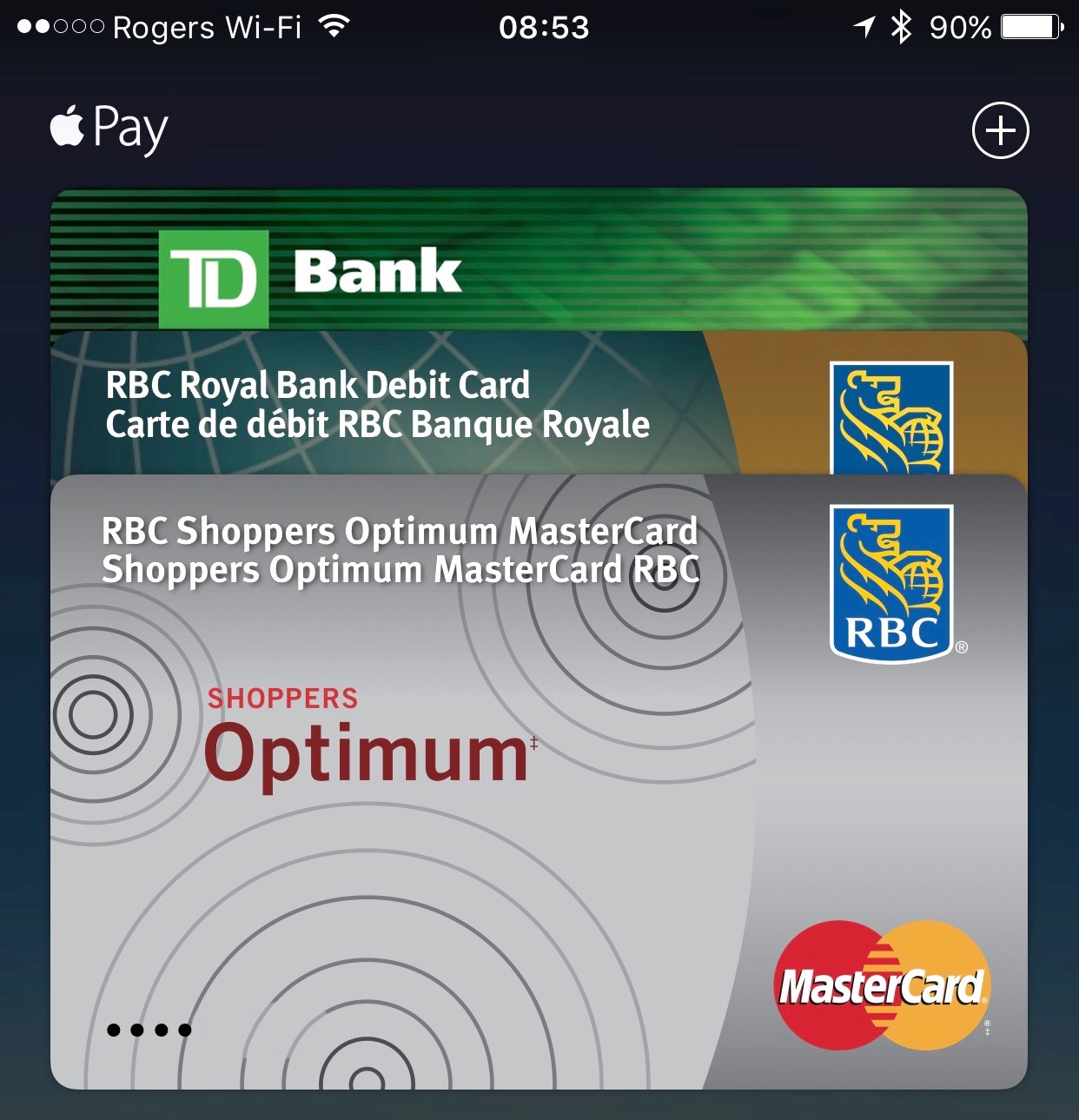
Woke up to the news this morning that Apple Pay has finally arrived in Canada. Exciting times, although the whole process took a lot longer than it should have, in my ever-so-humble opinion.
To be clear, I’ve been using Apple Pay since March, 2015, courtesy of having a U.S.-based TD Bank account, as part of TD Canada Trust’s Cross-Border Banking program. TD Bank added Apple Pay support to their credit and debit cards in late 2014, although I didn’t think of getting around to activating mine until a couple of months later. What was amazing about the whole process back then, however, is how well it all worked out. Apple Pay is basically just NFC contactless payments under the hood, so it uses the same technology as VISA PayWave and MasterCard PayPass physical cards, so every one of the millions of contactless payment terminals in Canada were ready for my U.S. based TD VISA Debit card from day one. Apple Pay coming to Canada was always more about the banks than the merchants.
-
Getting more Focused with OmniFocus
I’ve been a huge fan of OmniFocus for years. A desire to play and inherent techie curiosity have made me try a wide range of other task management solutions, ranging from the simple to the complex, but OmniFocus is always the one I come back to. One of the great things about OmniFocus is that as much as it tries to adhere to the David Allen GTD Philosophy, it’s still powerful enough to be flexible for use in a myriad of other ways. I’ve spent years tweaking my workflow to get it down to something usable for me, and while I’ve eschewed the “purist” GTD approach in the process, I’ve managed to come up with a structure that mostly works for my needs.
However, I’m always looking on the side for ways in which I can improve the focus and consistency of my workflow, and one of the great things about the OmniFocus community is how many people are on the same page in that regard, sharing ideas and unique ways of approaching task management, producitivty, and focus. So it wasn’t surprising when I had a “eureka” moment on coming across Kourosh Dini’s recent post on Grouping Tasks by Session.
-
Disqus 'Trusted Domains' aren't just a good idea...
While I’ve had Disqus comments setup at iLounge for a while, my own personal Disqus comments section has been mostly ignored for the past couple of years — when I went over to Blogger a couple of years ago, I traded them off for Google+ integration1 — although I never actually deleted my Disqus profile or comment history.
As a result, linking my Disqus comments back up to this new blog was a relatively simple thing. Add a few 301 redirects from the old URLs to the new, and let Disqus search through the site and update its links. That part worked fine, but when I looked at my list of Disqus Discussions on my admin control panel, I was in for a rather shocking surprise….
-
Like many, I believed Google+ would be a real thing back then, and it was fun for a while. ↩
-
-
Moving to Jekyll
My blogging needs are simple, and generally always have been, and when I started it as a static blog back in the days of iWeb and .Mac, those tools were all I really needed. However, the demise of those tools led me on a merry-go-round through WordPress — self-hosted and otherwise — Tumblr, and eventually onto Blogger. All tools that are great in their own regard, but have a level of bloat and complexity that I just don’t need for a simple little blog that probably gets about 10 hits a month, if I’m lucky.
I’d been contemplating turning all of it into a static set of web pages a few months ago — an idea that began to gell considering that my email provider of choice, FastMail, offers fast and stable static web hosting that I’m basically already paying for. However, I was left not being quite sure where to start, and the idea of converting everything from Blogger over to a static layout of HTML pages was slightly daunting — not in terms of the complexity, but just in terms of the time commitment.